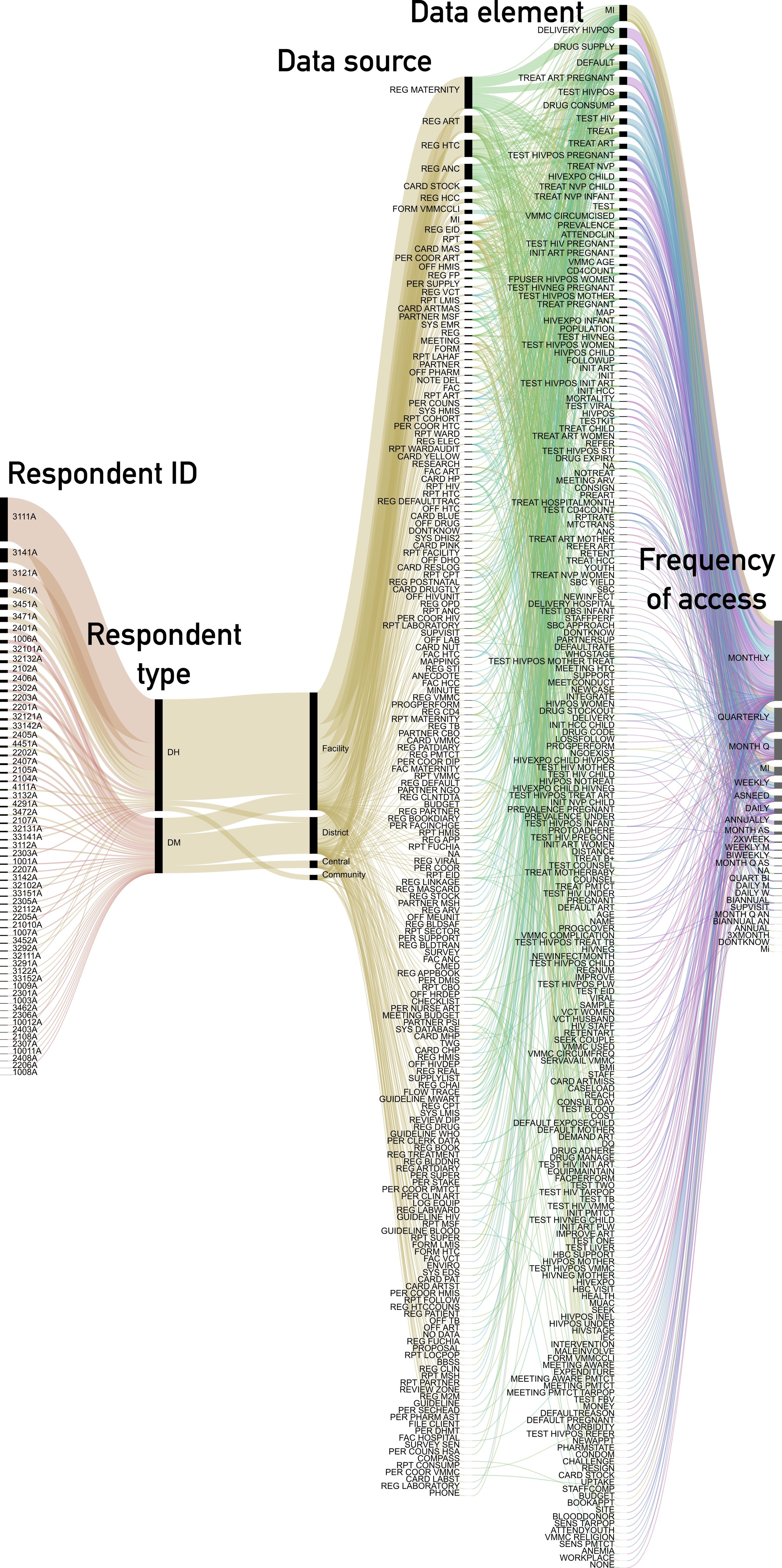
Sankey (flow) diagrams
Each of the 3 diagrams below provides a visual representation of the relationships that emerged between data users, systems, elements, and decisions. There are some additional attributes collected and included where useful, such as 'system level' and 'source type.' If these type of visuals are useful, we intend to make them interactive. In the meantime, use the Data Mapping Tool below to drill down or consider a specific perspective. Can this schematic of data use help to focus investments and streamline existing systems?


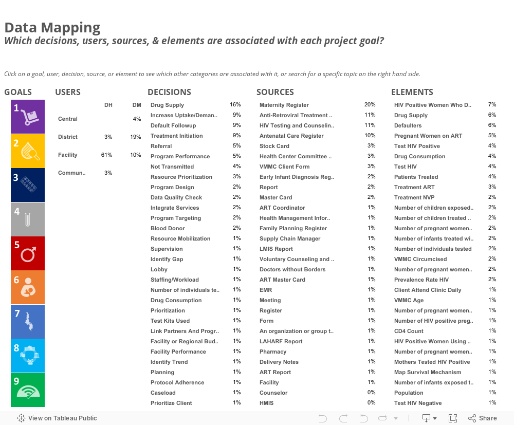
Interactive Data Mapping Tool
Use the dashboard below to explore relationships in which you may be interested. Working in a specific program area, like HIV testing and counseling? Click on the second goal below and see what users identified in terms of systems and elements used to inform specific decisions. Interested system specific tools, such as electronic medical records? Select 'EMR' from the list of sources and see which elements and levels identified this source and how it relates to program goals. How can this tool be used to investigate overlap and duplication? What about guiding standards and policies?
If dashboard isn't visible, please refresh your browser window.
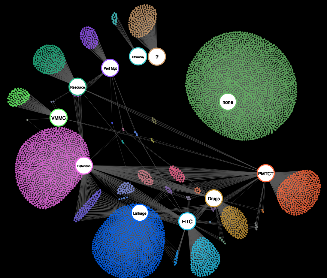
A network graph to map and relate data elements
The following graphic reflects an inventory of actual data elements across 5 systems in Malawi (both paper and electronic). 3,527 elements are currently included and we expect to eventually capture all data elements across the full set of systems that house HIV-related information. Elements below are grouped according to HIV program goal as defined in the Kuunika Project. Some goals have many elements that can inform decisions (retention), whereas others have few (efficiency). The data points that are linked by more than one line are relevant to multiple goals. How can this type of visual help to focus efforts on data quality, systems development, systems linkage, streamlining, etc.?